***Disclaimer***
This post is directed to members of the Church of Jesus Christ of Latter-Day Saints (or Mormons) who may be looking for ideas for the annual Girls Camp that we hold. However, if you are not a member of this church but are still looking for ideas, WELCOME! For those who are my regular readers for Digital Scrapbooking--make no mistake. My digital scrapbooking abilities were central in making this awesome camp take shape!
So I've been meaning to write this post since...like...September of 2016. So it's been like 8 months in the making. But here I am at last. I wanted to share what my ward did for Girls Camp in 2016 and how I used Photoshop to achieve some pretty awesome stuff. If you are looking for a great theme and some fun ideas for YOUR ward or stake, this might be the place for you!
A few details:
- I was called to be the camp director in mid-June for a camp that was to take place August 8. Thank goodness I'm a teacher and had the summer to prepare! This was my first time ever as camp director and it was awesome!
- Our stake alternates each year between individual ward camps and stake camps. As this was a ward camp, I had complete control over the theme, activities, and food. That made me a lot more creative!
- As I am a business teacher proficient in Photoshop, and as I have a high quality color printer, I was able to do a lot of things that many others may not be able to do. I also had access to a Silhouette machine that was very useful for the invitations especially. But never fear--much of my hard work is at your fingertips and you will be able to download some of the stuff I created if you want to use it. However, in order to make the files editable, some of them will require access to Photoshop, even if you don't know how to use it very well.
THEME - CAMPCON 2016
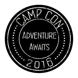 |
| Yes, I made a logo. Everything needs a logo! Thank you again, Photoshop! |
Our theme was
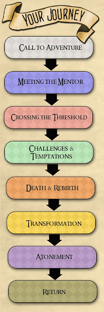
CAMPCON 2016, Adventure Awaits. We chose five different stories, or "fandoms" that we divided our girls into. If I were to do this on a stake level, I would choose a different fandom for each ward, but since it was a ward level, the girls were each divided into one of the five houses.
The five fandoms we chose were deliberate--we specifically chose fandoms that use the "archetypal journey." If you had to choose more than five fandoms, you would need to select carefully a well-known story that follows the path shown here. Our fandoms were:
- The Lord of the Rings
- Hunger Games
- Chronicles of Narnia
- Harry Potter
- Star Wars.
Each of these stories follows that journey--someone seemingly insignificant that meets a wise mentor who helps him/her leave home and go on a journey that changes the world. This same journey was taken by many characters in scriptures, as well as Joseph Smith. It resonates with us because it is also the journey that Christ took in his earthly ministry.
For our experience, the leaders were all Narnia, and the girls were divided into the other four houses.
THE INVITATION
Anticipation is everything. I wanted it to be really clear that this was going to be an AWESOME camp. We don't have a lot of girls in our ward and I wanted ALL of them to come! So I created a really fun invitation. It's a little much--but I only had to make 9 of them so it wasn't that big of a deal. If you would like an editable copy of this invitation, please email me and I will send it to you. But be warned--you WILL need access to Photoshop and you will also need to install the correct fonts. Contact me for more details.
I took care to include elements of all five fandoms in the in the invitation--the Narnia door with the Hobbit sign on it, the Hogwarts envelope (containing their permission slip) the information text in a Star Wars scroll perspective, and of course the famous line, "May the odds be ever in your favor."
This invitation was, I admit, a ridiculous amount of work. But...I'm a nerd and creating stuff like this is just fun for me, so don't judge. :) But it did get the girls excited and--did I mention I put a magnet on the back? It went very nicely on the fridge!
THE SCHEDULE AND THE MARAUDERS MAP
The next document I created was also a real study nerdiness that makes me good at my job. I made each girl...wait for it...a marauder's map! It included their schedule, rotations, the camp theme song (I'll get to that), scriptures to memorize and a few other goodies. I adapted it from
this site, though in the end I kept very little of the original work.
This thing was also a nightmare and a lot of fun to create. It required me to print on the back as well. The scriptures fold up and go on the empty scripture panel, and the center area is the contract that is folded and glued there. Then it folds up and has a little ribbon bringing it together. Super cute, but unfortunately I don't have a good picture of it all together. I just have this shot of me showing it to the girls. You can kind of see how it looked and what the outside looked like from the ones the girls are holding. They really were freaking awesome. Could you do this idea without the map? ABSOLUTELY. I'm just a nerd.
However, here is an up close shot of our schedule:
(please ignore the fact that I put July instead of August...)
SORTING INTO HOUSES
Now, if I lived in a ward with LOTS of girls, I would have had each year be a different house--the first years are Harry Potter, and so forth. And each tent would be to that theme. But as we only had 9 girls, this wasn't going to happen. But it could definitely be done that way!
After tents were set up, we gathered in the pavilion for the "sorting." We had acquired a Harry Potter Sorting Hat. Each girl was called up one by one to be sorted. Prior to putting the sorting hat on their head, I put a colored bandanna with a badge on it that had a symbol for their house inside the hat. (Oh yes, I also have access to a badge machine, MOST useful.) Then we put it on their head and they got to take it off and take out their bandanna. Later, they got a t-shirt in the same color.
Yellow - Hunger Games
Red - Harry Potter
Green - Lord of the Rings
Blue - Star Wars
Purple - Narnia (this was just for the leaders, but we all got them too!)
T-SHIRT CRAFT
Each girl also got a colored shirt. We did a craft where we used a silhouette on paper, pinned it to the shirt, then use bleach in a spray bottle to spray all around it. Then you remove the silhouette. It looked super awesome. I also have the silhouette files if you want them! (cutting them out with my Silhouette machine was MOST useful. I just wish I'd cut out several of them instead of using the same one over and over. It got pretty beat up.)
THE CHALLENGES
Of all the things on this site, this section might be the most use to you if you are going to try and do this theme. This is the heart of the entire theme and IT. WAS. AWESOME. If you look at the schedule, you'll see that we have five challenges scheduled--one for each of the five houses. Four of them were purely for fun, and the fifth one was the spiritual experience.
Challenge #1 - Hunger Games
You could do the challenges in any order, except that it's important that Hunger Games is first and Narnia is last. Hunger Games sets up all the other challenges. It will require a bit of planning before hand but it's none of the items needed are expensive or difficult to obtain.
What You Will Need:
Two items for each house, so eight items. If you have a large group you may want to do more. (Keep in mind that Narnia was the leader house, so I only did this with four houses)
- Squirt gun
- Spoon (just a regular old spoon)
- Plastic shovel (like at the $1 store)
- A ball of some kind, medium sized
- A gun that shoots projectiles
- A sponge
- Small bucket
- A syringe
You will also need a small table of some kind. I just used a camping fold up one. Find a big open area and place the table in the center with all the items on it. This is your "cornucopia." You will also need to come up before hand and bury an item for each group. I just made a little box with a badge in it--it doesn't really matter what it is. Just something they can dig up. Make sure to mark it with a rock or something to help them find it.
Line the girls all around the table, about 10 feet away in a circle. When you call time, they will all run to the center and grab what they can. Each house gets two items, so you will only want two representatives from each group--or if you have more items, you can add more reps. Now, they have NO IDEA what they will be using their items for. This is why it's hilarious.
Challenge A - Water Torture
Now that they have their items, instruct them in the first challenge. Place four small tubs along a path or a table. Then put a bucket across the way. Tell the girls to choose a tribute to complete the task. Using one of their items, they must move the water from their tub to the bucket.
It's pretty hilarious to watch someone try to empty a tub with only a spoon, or a water gun. The small bucket and the sponge definitely worked best. Note that I also have plastic cups with the bad guy from their house on it--this was just to identify which house was at which station. I used those cups again in a later challenge.
Award points for the one who gets it transferred first.
Challenge B - Shoot It
Next, the girls will need to kill the villain of their story. Using the cups pictured above, place them along a table. The girls, using whatever items they have, have to knock the cup over of their villain. This was also hilarious. The squirt gun worked ok, but actually I think the bucket won in this challenge! Award points to the group that kills their villain first!
Challenge C - Dig It Up
The last challenge, the girls had to dig up a prize in the ground. Using what they have, they need to dig up the prize for their group. I told each group a general direction and that it was marked with a rock. If they struggled I did the hotter/warmer game to help them. Whoever digs it up first is awarded points.
We had a place on their Marauder's map to score points, but do it however you like!
Challenge #2 - The Lord of the Rings
For this one, I combined the challenge with the required hike. When the girls went on their hike, they took with them a small paper bag with a handle that had a list of items they needed to find. Each house had a bag, so they worked in teams. When they came back from the hike, I awarded them points if they got each item. I also allowed them to take pictures of the items with their phones.
Challenge #3 - Star Wars
For Challenge 3, we had a Minute to Win It challenge, with all the challenges themed for Star Wars. This was SO FUN. But it did require quite a bit of prep. Here are the games we played, and if you want it in a file, click
here:
1.
Game #1 -
Like a Trooper
a.
Storm troopers are known for two things: shiny
white armor, and terrible aim! In this challenge, prove you have what it takes
to be a storm trooper by shooting rubber bands at the cards set up on clothes
pins. Points for every one that you make—but if you hit it, you are NOT cut out to be a storm trooper!
i.
Playing cards
ii.
Clothespins
iii.
Rubber bands
2.
Game #2 – Heart of the Light Saber
a.
The heart of any light saber is the Kyber
Crystal, a mysterious mineral from outer space that gives the light saber its
power and its color. In this challenge you must sort and line up the blue,
green, and red Kyber Crystals from the bag of candy so that you can build light
sabers in all three colors.
i.
Sort Skittles by color into different plates
using a straw
ii.
Paper Plates, straws, large bag of Skittles
3.
Game #3 – Shoot! We’re in the Garbage!
a.
You have fallen into the garbage shoot! Using
limited materials, you are trying to brace the walls, or keep your bodies
higher, as the garbage compactor starts.
You are waiting for C3PO to stop the walls, but he’s taking forever.
Will you make it? A stack of 30 cups each, plus one C3PO cup on the bottom.
Stack the top cup on the bottom until the C3PO cup is at the top.
i.
60 Cups
ii.
2 C3PO Cups
4.
Game #4 – Get to the Control Panel!
a.
You are racing through the Death Star with a
host of storm troopers on your tail! You open a hatch, only to discover that
there is a giant cavern below and a narrow bridge running across it. Can you
get across the bridge and not fall off? Begin the game by placing the popsicle
stick in your mouth. Then start the clock. Using your hands, begin building a
tower of dice, one by one, on the end of the stick. To win this game, you must
have a vertical stack of six dice on the end of the stick, and it must be freestanding,
all within one minute.
i.
Dice
ii.
Popsicle Sticks
5.
Game #5 – Starving in Carbonite
a.
You are Han Solo, and have been frozen in
carbonite a long time. You are SO hungry. You only have a little bit of
movement in your face. Move the cookie from your forehead to your mouth. If you
make it, use your hand to start again. See how many times you can get the
cookie to your mouth in 30 seconds!
i.
Cookies
6.
Game #6 – Shoot the Target
a.
Luke had to have superior aim to reach the
critical weak point in the Death Star. With perfect precision, he shot the
target and blew up the giant ship in a matter of seconds. Can you do the same?
Aim the marshmallows at the cup on your partner’s head—whoever gets the most in
60 seconds wins!
i.
Tupperware (2)
ii.
Headbands
iii.
Tape
7.
Escape the Death Star!
a.
You are trying to load the tie-fighters and
escape through the narrow opening before it closes! Get as many people out as
you can! Place 8 tennis balls in an empty tissue box. Belt it around your waist
in the back. In one minute, get as many out as you can without using your
hands.
i.
Tennis balls
ii.
2 Belts
iii.
2 empty tissue boxes
Challenge #4 - Harry Potter
For Harry Potter, we had a game of charades. We gathered around the camp fire, and each girl was given a magic wand--I got them for like $20 on
Etsy--totally worth it. They are also a great craft you can do with the girls, but it required hot glue so you'd have to do it before you go up to camp.
Out of a bag, they drew slips of paper with actual spells from Harry Potter on it. Then they have to act it out for the other teams. The guessing teams don't have to know the name of the spell, but the do need to guess what the spell does.
Challenge #5
This one KILLED me. I can make things fun and exciting--but the spiritual side always scares me to death. I knew I wanted to make the last challenge Narnia, because of all the stories, it is the one most aligned with the story of Christ. I had prepared passages of scripture that go along with passages from the book--I knew many of the girls might not know this story as well--but I honestly did not know what I was going to do other than that. I kept thinking it would come to me and it never did. And then, only about an hour before the Narnia challenge was to begin, the girls all went on a spur of the moment hike. I was left behind with one other leader. And it just CAME to me. We combined the third year challenge of using a compass (thank goodness I had bought one for each of them!) with a scavenger hunt.
The other leader and I frantically made two scavenger hunts, dividing the girls into two teams. They each had a starting point, which was a piece of paper with a scripture (one of the ones I'd previously looked up) and a compass direction. They'd follow that direction until they found their next slip of paper with the direction and the scripture. We made two different routes that both ended at the pavilion. The girls raced to see who could complete the challenge first. This is a challenge that you really can't prepare until you are up there anyway, so I know it was the Lord that lead me to do it! It was awesome!
After they got back, we gathered around the table at the pavilion to read the scriptures, and I read along the same story from Narnia. We discussed each step the Savior took to save each one of us. It was actually really, really amazing.
*Note: All but one of the scriptures comes from the Bible. There is one scripture that comes from The Book of Mormon. If you are from another Christian church who does not use the Book of Mormon, you can omit that scripture or find another to replace it.
THE THEME SONG
Ok. Now I'm seeing why I put this off so long. This is SO LONG!!! But just two more sections left! I did actually have an amazing theme song for this camp. I used a song from the obscure but amazing musical of Lord of the Rings. I took the song, called Now and For Always, and I rewrote the words to fit our theme. I found a piano version of it and cut the music so it could have seven verses. You can download the song below--this is the version with me singing it.
*Note: There is one verse that talks about Joseph Smith. If you are from another Christian church, you can omit this verse.
Here are the words:
THE SONG BOOK
And FINALLY, the song book. I HATED the song book that was leftover from the last camp. I don't think it had been updated in like 20 years. There were songs in there that made NOOO sense. So I made a new one. Now, this thing is big. It's like 70 pages, though that's only 35 pages front and back, right? So it's big. Print it front to back, cut it in half, and bind it. Then use it every year. But I added some new songs to it and took out any songs that I could find no record of anywhere on the internet. I mean, if no one knows the tune, why is it in there?
Well, this has been a NOVEL, let me tell you. Please, if you use any of this, comment below so I know it was worth the hours it took to type! Please contact me if you need files not provided here.