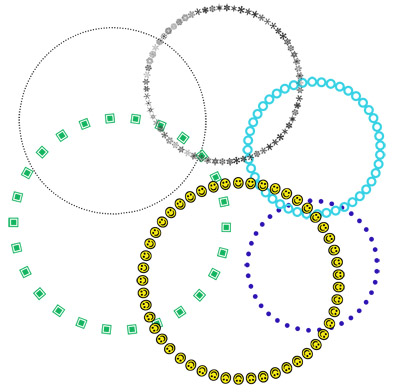
I thought I'd do a quick tip on creating dotted circles. It's something I personally haven't used much, but I know there are a lot of people who do. It's a very simple thing to do! I am sure there are MANY ways of doing this, but I am creating it using the Paths feature. Now that I've really played around with this, I think I'll start using it a lot more! I was having SO much fun coming up with fun ways to do it! You can really have a lot of versatility by changing the font, size, color, spacing, etc. Here are some of the dotted paths I made:
So I'll start by explaining step by step how to do a basic dot path. Once you can do that, you can try lots of different things, like I did. I'll explain how I did a few of the ones in my example. Know that if you are looking into a more professional designer, you would probably want to use Illustrator.
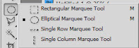
STEP 1: First, click on the eliptical circle tool. If you want your circle to be perfectly round, hold down the Shift key while clicking and dragging, and it will make an even circle. Make it approximate size you want.
STEP 2: Next, open up your Paths toolbar. If you don't have it, go to Window, Paths. Click on the menu icon in the upper right corner.
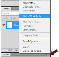
Then, click on "Make Work Path" from the list. It will ask you for the tolerance level, and give you a default of 2.0 pixels. That's fine--just click ok.
You will now notice that the circle is no longer outlined with "marching ants' but is now solid.
Click on your Text box tool.
STEP 3: Now, put your cursor anywhere over the circle outline. Pay attention here--the cursor will change depending on where you place it. When you hover over the line of the circle, it will have a little squiggly line next to it. Click on the line. Now you will have a cursor point to start typing. As you type, it will type around the circle, starting with where you clicked, all the way around.
STEP 4: To make a basic dotted circle, just type the period over and over until it covers the whole circle all the way around. Make sure to change the font and the font size so that your dots are the size you want. You can, of course, change the font color as well to be what you want it to be.
STEP 5: If you are certain that it's how you want it, you may want to Rasterize it. You don't have to, but I like to because, personally, I can't stand seeing the path and I like it to be treated as an image and not text.
Making Your Dots Even:
Because you are creating this as text, and not an image, you are limited by common text problems. The main problem is that the dots don't line up evenly from start to finish. This means that you have too wide or too narrow a space between your first and last dot. There are two ways to fix this:
1: Change the font size. In this example, circle 1 is using a size 48 font. In circle 2, I just highlighted the path and changed the font to 55. The dots are slightly bigger, but they line up much better.
2: Change the width kearning. To do this, go to Window and open Character. Then pull down the width menu, as shown, and choose a larger or smaller number. What you are choosing is how much space there is between each character.
 Mixing it Up!
Ok, now that we have the technique down, lets talk about some of the fun different ways you can use this!
Using different fonts - Some fonts have some really funky periods. You can get a very different look but using different fonts in this technique.
1 &2 - Both of these were created by using the period key with a different font--the font is listed there.
3 - This time I used the square marquee tool instead of the eliptical. I used a font that had square periods instead of round ones. Then then I rasterized it. This allowed me to then double click on the layer and go to the Layer Style and add a gradient overlay and a drop shadow to it. Once you rasterize the layer, you are changing it from text to an image--you can then use a lot of other techniques on it like Layer Styles, even actions.
4 - This one I used Wingdings as the font, and did Capital J, which gives the smiley face. After creating it, I rasterized it, then used the fill bucket to color each smiley face yellow.
5 - This was a special font I downloaded awhile ago called WWFlakes--each letter is a different snowflake. For this example I just typed the alphabet and got different snowflake patterns.
6 - You can actually do this on ANY shape. Just draw the shape, or chose anything that has the shape you want--for this I actually pulled in something from a kit that was in that shape. Then just CTRL+Click on that layer so that you get marching ants around it. Then follow the same instructions--make it a work path, and add your text.
One other note on #6--I actually decided it would look much better if the dots were on the INSIDE of the path rather than the outside. I had to do a little research to figure out how to do that. Here's how:
Once you create the path, ENTER YOUR TEXT FIRST.
Then click on the Path Selection tool. I had never used this tool before! This is NOT the selection tool at the top of your toolbox. I found mine right below the Test box button.

Now, hover your cursor over you text path. You will see the "I" cursor with arrows on both side. Just click and drag inward. Now your dots will be on the inside of the path rather than the outside.
Well that was fun! I hope you found this tutorial helpful!